

Hoodie Logo Placement Guide: Best Positions, Print Sizes & Design Tips
The most reliable hoodie logo placement is the left chest, at roughly 3 to 4 inches wide, with the main graphic on the center chest, full front or back. The right position depends on the hoodie’s construction: the hood, drawcords, kangaroo pocket, zipper, seams and size range all limit where artwork can sit and how large it can be.
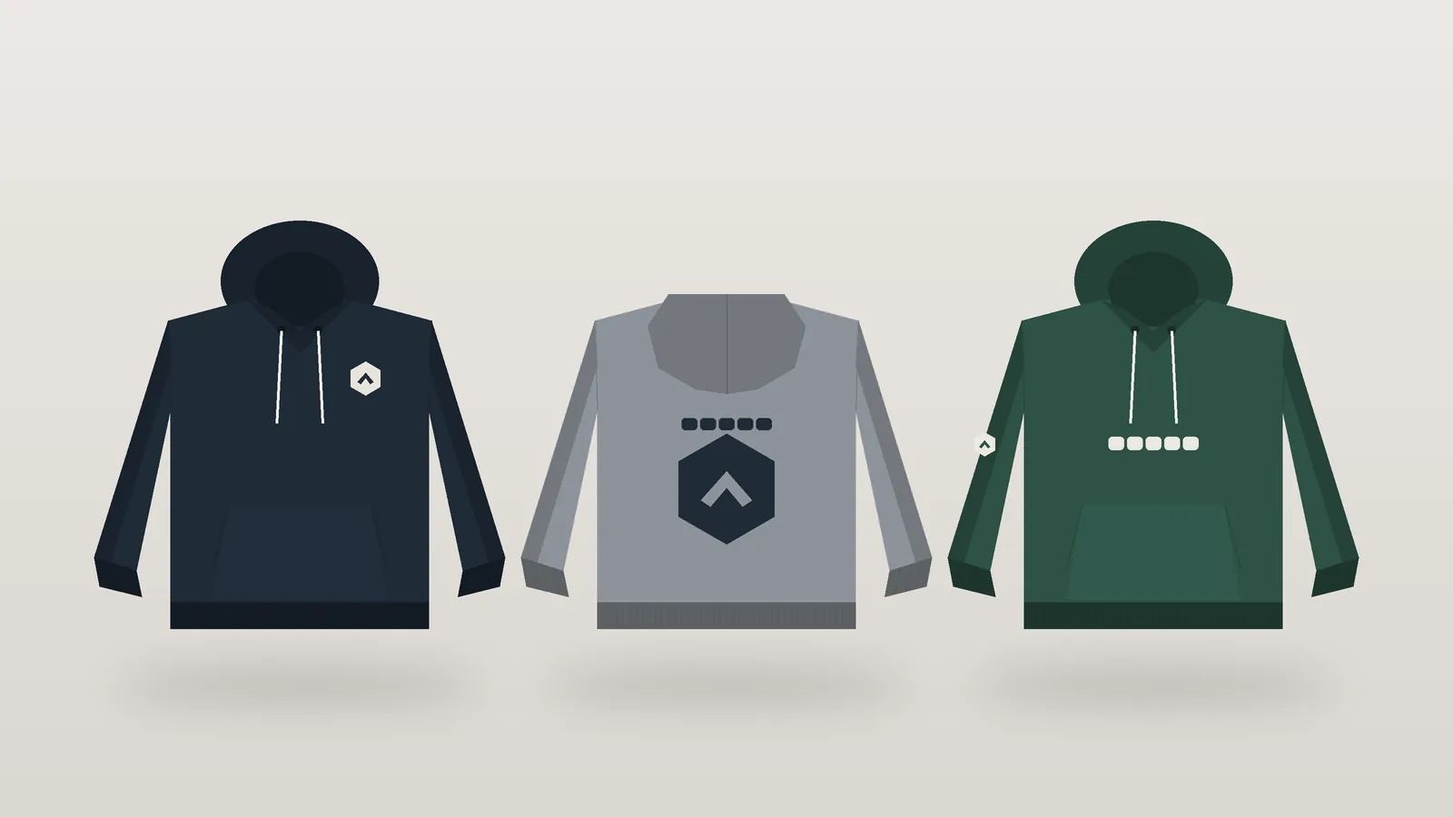
That last point is where most placement guides stop short. A hoodie is not a T-shirt with a hood attached. Its hood covers part of the upper back, its pocket cuts across the lower front, and a full-zip version splits the chest in two. This guide treats hoodie logo placement as a product-development decision: where each position works, what size to start from, how to measure it on every size in your run, and how to approve it before bulk production.
About the measurements in this guide: the sizes below are common starting points drawn from published decoration guides and garment spec sheets. Maximum print and embroidery areas vary by hoodie pattern, garment size and decoration method, so always confirm them against your own sample and your manufacturer’s spec.
Hoodie Logo Placement Positions Compared
Each hoodie logo placement does a different job. Choosing well starts with knowing what each one is good at and what it costs you.
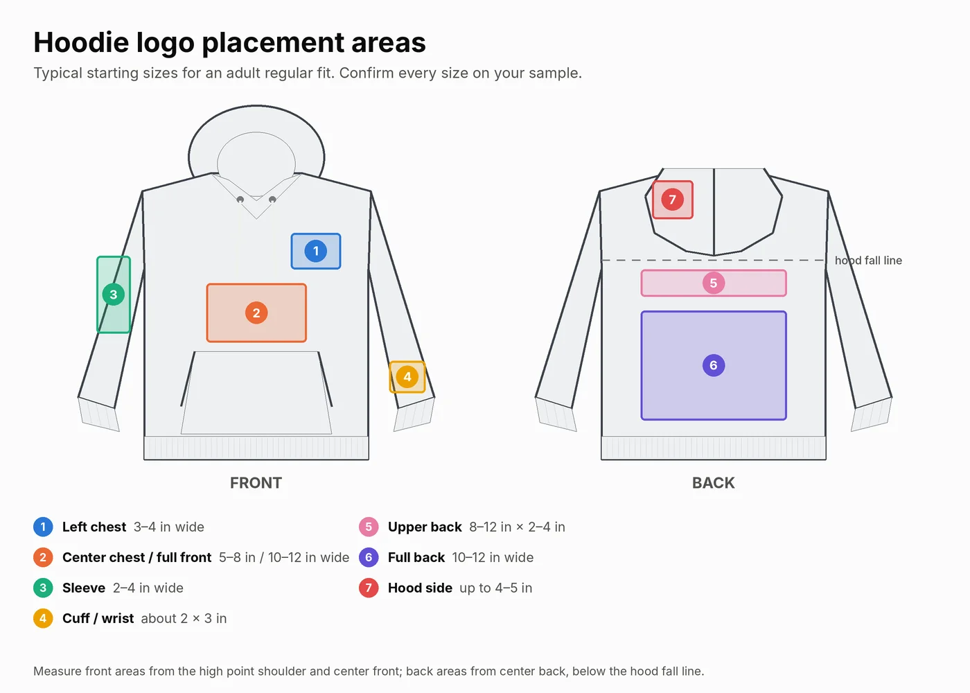
Left Chest
The left chest (the wearer’s left) is the default for brand marks, uniforms and premium basics. It reads as deliberate rather than promotional, works with both print and embroidery, and leaves the back free for a second message. Its limit is scale: detailed artwork, fine lines and small text lose clarity at 3 to 4 inches wide, especially in thread.
Center Chest
A center chest logo sits on the center-front line, above the pocket and below the neckline. It is the natural home for a wordmark or team name. On a pullover, the main constraints are the drawcords above and the kangaroo pocket below, so the usable height is smaller than it looks on a flat mockup.
Full Front
A full-front graphic is the statement placement for streetwear and merchandise. It needs a pullover with enough clear panel between the neckline and the pocket. Large prints across the pocket are possible, but the pocket seam and opening will interrupt the artwork, so the design has to be planned around them rather than discovered at sampling.
Upper Back
The upper back carries short text well: a website, a city, a team name or “STAFF.” The catch on a hoodie is the hood. When the hood is down, it falls over part of the upper back, and how much it covers depends on the hood’s depth and construction. Measure where the hood actually rests on the sample before you fix the artwork position.
Full Back
For hoodie back print placement, the full back is the largest canvas on most hoodies and the best place for a detailed illustration. It reads from a distance and survives most decoration methods. Its usable area starts below the hood fall line, not at the neck seam, which makes the real canvas shorter than a T-shirt back.
Sleeve Logo Placement
Sleeve logo placement works for secondary marks: a small icon near the shoulder, a vertical wordmark down the forearm, or a flag. They add detail without competing with the chest logo. Curvature, raglan seams and the narrowing toward the cuff all limit width, so long, narrow artwork suits sleeves better than square artwork.
Cuffs and Wrists
A small embroidered mark or a woven tab just above the cuff is a quiet premium detail. Rib knit stretches, so printing directly onto the cuff rib risks cracking or distortion. Keep decoration on the sleeve panel above the rib.
Hood
The hood side panel can carry a small embroidery, print or patch, typically seen from the side or when the hood is up. Hoods are usually two layers, curved, and awkward to hoop or press once the garment is sewn, which is why hood decoration is easier when it is planned in production rather than added to a finished blank.
Small Secondary Areas
Woven labels at the hem seam, a tab at the pocket corner, a small print at the back neck below the hood seam, or a mark on the drawcord tips all add finish without much artwork. These work best as a second layer of branding next to one main logo.
Hoodie Logo Size Chart by Placement
Use these hoodie logo placement figures as a starting brief, then confirm every one on your sample. They are typical starting sizes, not maximum print areas, and they assume an adult regular-fit hoodie.
| Placement | Typical starting size | Measurement reference | Best application | Important limitations |
|---|---|---|---|---|
| Left chest | 3–4 in (7.5–10 cm) wide | Measured down from the high point shoulder and across from the center-front line | Brand marks, uniforms, premium basics | Fine detail and small text lose clarity; keep clear of drawcord eyelets |
| Center chest | About 5–8 in (13–20 cm) wide for print; embroidery commonly up to about 4 × 4 in | Centered on the center-front line, below the neckline | Wordmarks, team names | Limited height between drawcords and pocket |
| Full front | About 10–12 in (25–30 cm) wide | Centered on the center-front line, top edge below the neckline | Streetwear graphics, event merch | Pocket interrupts the lower edge; not possible as one piece on a full-zip |
| Upper back | About 8–12 in wide by 2–4 in tall | Centered on center back, below where the hood rests | Website, team or role text | Hood can cover it when worn down |
| Full back | About 10–12 in (25–30 cm) wide; some styles allow up to about 14 in | Centered on center back, starting below the hood fall line | Main illustrations, back-print streetwear | Maximum area varies by style and method |
| Sleeve | About 2–4 in wide; long vertical prints are often limited to about 3 in wide | Along the sleeve center line, measured down from the shoulder seam | Secondary marks, flags, vertical text | Curvature, raglan seams and taper |
| Cuff or wrist | About 2 × 3 in embroidery, or a woven tab | Sleeve panel just above the cuff rib | Subtle premium detail | Avoid decorating the rib itself |
| Hood side | Up to about 4–5 in | Centered on the hood side panel | Streetwear detail, secondary mark | Double layer and curved surface |
Why the Right Hoodie Logo Size Changes
Four variables move these numbers. The garment pattern sets the panel dimensions, so a boxy oversized cut has more chest width than a fitted one. Garment size changes the panel by several inches between the smallest and largest sizes. The decoration method sets its own limits: embroidery is constrained by hoop size and stitch count, while screen printing and DTF are constrained by the platen or transfer size. And logo shape matters, because a wide wordmark and a square icon at the same width occupy very different areas.
How to Measure Hoodie Print Placement Correctly
Hoodie logo placement only stays consistent if every measurement starts from the same fixed points on the garment, and accurate hoodie print placement depends on those points more than on any template.
Use Fixed Reference Points
- High point shoulder (HPS): where the shoulder seam meets the neckline or hood seam. Vertical front measurements start here.
- Center front and center back: the vertical center lines of the body. Horizontal positions are measured from these.
- Shoulder seam: the start point for sleeve placements.
- Hood fall line: where the hood rests on the back when it is down. Upper-back and full-back prints start below it.
Avoid measuring from the hem or the pocket. Their position shifts between sizes and between production lots, so artwork measured from them will drift.
Published embroidery guides commonly place a hoodie left chest logo about 5.5 to 8 inches below the shoulder seam and about 4 to 6 inches across from center front. Treat that as a range to test on your sample, not a fixed point, because hood seam height and neckline shape change it.
Work Around Hoodie Construction
- Ribbing: keep artwork off cuff and hem rib. It stretches and recovers, which distorts prints and puckers embroidery.
- Drawcords and eyelets: leave clear space below the eyelets for center chest and full-front designs, so cords do not hang across the artwork.
- Kangaroo pocket: measure the pocket top from the HPS on every size and keep the main artwork above it unless the design is meant to cross it.
- Seams: avoid running fine detail across shoulder, raglan or side seams. Seam allowance creates a ridge that breaks thin lines.
- Curved surfaces: the hood and the upper sleeve curve away from a flat press. Smaller, bolder artwork holds up better there.
Grade Artwork Across Sizes
The same artwork width looks different across a size run. Take a hypothetical hoodie whose chest width (measured flat, pit to pit) is 20 inches in size S, 22 inches in L and 24 inches in 2XL. An 11-inch front graphic covers half the chest on the L, 55% on the S and about 46% on the 2XL. On a wide size run, that change is visible.
Brands usually solve this with two or three artwork sizes rather than one. For example, a smaller version for XS to M and a larger one for XL to 3XL, keeping the artwork at a similar share of the chest. The vertical position needs the same check, because the gap between the HPS and the pocket top also changes with size.
Pullover vs Zip Up Hoodie Logo Placement
The two styles share sleeves and back placements but differ completely at the front.
| Front placement | Pullover hoodie | Full-zip hoodie |
|---|---|---|
| Left chest | Works well | Works well; keep clear of the zipper tape |
| Center chest | Works well above the pocket | Only as a split design across the zipper |
| Full front | Works, planned around the pocket | Split across the zipper; alignment risk |
| Back | Main canvas | Main canvas, often the stronger choice |
For zip up hoodie logo placement, the safest approach is a left chest logo on the front with the main graphic on the back. If the brand needs a large front design, split it into two halves designed to read as two separate shapes, so a small misalignment at the zipper does not look like an error. Keep artwork away from the zipper tape and placket, which are stiffer than the body fabric.
On a pullover, the kangaroo pocket is the main front constraint for hoodie logo placement. Either keep the graphic above the pocket top, or design it to cross the pocket deliberately, with nothing critical (text, faces, thin lines) sitting on the pocket seam or opening.
Oversized Hoodie Print Placement vs Regular Fit
An oversized hoodie is not just a bigger regular hoodie. Dropped shoulders move the shoulder seam down the arm, the chest panel is wider, and the body is often longer. Three adjustments follow.
- Scale artwork to the panel, not the label size. An oversized M can have more chest width than a regular L, so it can carry a larger front or back print.
- Recheck the left chest position. With a dropped shoulder, a left chest logo measured from the shoulder seam sits too far out toward the arm. Measure from the HPS and center front instead.
- Place sleeve marks lower. The shoulder seam sits on the upper arm, so a sleeve logo measured the usual distance from that seam lands lower than on a regular fit. Decide the position on the sample.
Never assume one set of measurements covers XS to 3XL across both fits. Treat each fit as its own pattern with its own placement spec.
Hoodie Embroidery Placement vs Print Placement
This section covers placement only. The choice between print methods is a separate decision.
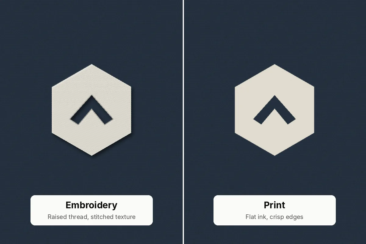
- Embroidery suits the left chest, sleeves, cuffs and hood side. Its size is limited by hoop size and stitch count, so large embroidered fronts and backs are possible but heavy, stiff and more expensive. Hoodie embroidery size for the left chest commonly sits around 3.5 to 4 inches wide, and many decorators use about 4 × 4 inches as the standard chest area.
- Screen printing suits large fronts and backs with a limited number of solid colors. It needs a flat surface, so hood and cuff positions are difficult on finished garments.
- DTF transfers suit detailed, multicolor artwork on the chest, back and sleeves, and can be pressed onto smaller curved areas more easily than a screen.
- Woven labels and patches suit hems, pocket corners, hoods and sleeves where a flat, durable branded element works better than ink or thread.
In made-to-order production, decoration can often be applied to cut panels before the hoodie is sewn. That makes positions such as the hood side, near seams or along a sleeve much easier to decorate cleanly than on a finished blank. If a placement looks difficult, ask whether it can be decorated at panel stage.
Hoodie Logo Placement Mistakes and How to Avoid Them
Most hoodie logo placement problems only show once the hoodie is worn, washed or produced in a full size run.
- Artwork placed by eye. Two operators eyeballing a “left chest” produce two positions. Fix every placement with distances from the HPS and center line.
- One artwork size for every garment size. A full-front print that looks right on an L can crowd an XS and look small on a 3XL. Grade it.
- Back prints hidden by the hood. Upper-back text placed at the neck seam disappears when the hood is down. Start back artwork below the hood fall line.
- Oversized artwork. A graphic that runs into the side seams, sleeves or pocket looks accidental. Leave visible margin around it.
- Awkward sleeve positioning. A sleeve mark too close to the shoulder seam folds into the armhole; too close to the cuff, it disappears when sleeves are pushed up.
- Unreadable small text. Thin fonts and small taglines fill in with ink or merge in thread. Test small text on the sample before approving.
- Designs across unsuitable seams. Fine detail across a raglan or side seam breaks. Move it or simplify it.
- Ignoring the drawcords. Cords hanging over a center chest logo hide the top of it every time the hoodie is worn.
Artwork Preparation and Manufacturer Approval Checklist
A hoodie logo placement is only as consistent as the file and the spec behind it. Before you request samples, prepare:
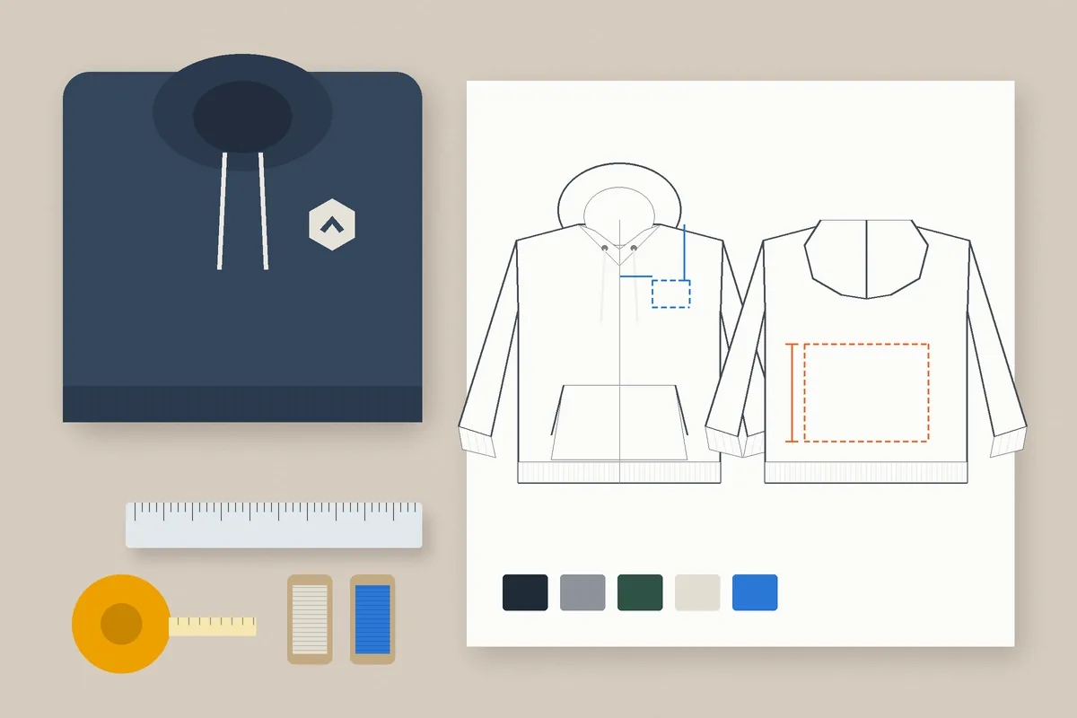
- Artwork dimensions: final width and height for each placement and each graded size, in inches or centimeters.
- Vector files: AI, EPS, PDF or SVG for logos and text, with fonts outlined.
- Raster files: high-resolution PNG at the actual print size for photographic or textured artwork.
- Color specifications: Pantone references for ink and thread colors, plus the fabric color each artwork sits on.
- Placement mockups: a front, back and sleeve view showing every logo with distances from the HPS, center front, center back and shoulder seam.
- Fabric and decoration compatibility: confirmation that the method suits the fleece weight, pile and fiber content.
- Garment sizing: which artwork size applies to which garment sizes.
- Sample approval: a physical sample for each fit, checked on a person, not just flat.
- Production consistency: the approved placement written into the tech pack with an agreed tolerance, so reorders match the first run.
If you are producing your own range rather than decorating blanks, the placement spec belongs in the same tech pack as fabric, fit and trims. That is where custom hoodie manufacturing differs from print-on-demand: placement is decided with the pattern, sampled, signed off and then repeated in bulk.
Hoodie Design Placement Recommendations by Brand Type
The best hoodie logo placement depends on what the buyer needs the hoodie to do, so the same logo is placed differently for a gym, a streetwear label or a corporate team.
Fitness and Gym Apparel Brands
Keep the front clean with a left chest or small center chest mark, and use the back or sleeve for a secondary message. Members train in these hoodies, so place nothing on the underarm or side panels where stretch and friction are highest, and favor flexible prints or flat embroidery that will not feel stiff when moving.
Streetwear Brands
Streetwear carries the boldest placements: full fronts, full backs, hood side marks and long sleeve prints. The risk is crowding. Choose one hero placement per hoodie and support it with at most one or two small details, and plan large fronts around the pocket from the start.
Minimalist Premium Clothing Brands
Premium labels usually rely on restraint: a small tone-on-tone embroidery at the left chest, a woven tab at the hem or a discreet back-neck print below the hood seam. The quality of execution matters more than size, so approve thread color, stitch density and label finish on the sample.
Corporate Merchandise Buyers
Corporate hoodies need a recognizable, consistent logo across staff in every size. A left chest logo with a website or department on the upper back covers most needs. Lock the logo size to the brand guidelines and grade it only if the smallest and largest sizes look wrong at one size.
Private Label Clothing Businesses
Private label brands are building a product line, not a single order, so the priority is repeatability. Fix placements in the tech pack, keep the same reference points across every style in the range, and use matching label and tab positions so the collection reads as one brand.
US brands that source abroad should build the placement spec before the first sample, because every revision adds shipping time. Best Gym Wears works as one of the fitness apparel manufacturers for USA brands, producing in Sialkot, Pakistan, and shipping to US buyers, so a clear placement brief at the start keeps sampling rounds to a minimum.
Frequently Asked Questions
Should a hoodie logo go on the left or right chest?
The wearer’s left chest is the convention for brand marks, uniforms and corporate apparel, so most buyers expect it there. The right chest works well for a secondary mark, such as a sponsor, a department name or an employee name, alongside a left chest logo. On full-zip hoodies, both sides work as long as the logo stays clear of the zipper.
Can I use the same logo size on every hoodie size?
For small logos such as a left chest mark, one size often works across a normal size run. For large front and back graphics, the same artwork can look crowded on small sizes and undersized on large ones. Many brands use two or three graded artwork sizes so the design keeps similar proportions from XS to 3XL.
Is it OK to print a hoodie design over the kangaroo pocket?
Yes, if the design is planned for it. The pocket seam and opening break the print surface, so avoid putting text, faces or thin lines across them. Bold, simple shapes cross a pocket better than fine detail. For most logos, keeping the artwork fully above the pocket top is the cleaner choice.
What file format should I send for hoodie logo placement?
Send vector files (AI, EPS, PDF or SVG) for logos and text, with fonts converted to outlines. For photographic or textured artwork, send a high-resolution PNG at the final print size. Include a mockup showing each placement with measurements and color references, so the manufacturer can digitize or separate the art accurately.
Can one hoodie combine embroidery and printing?
Yes. A common combination is an embroidered left chest logo with a printed back graphic. Each placement is decorated separately, so confirm the order of operations and approve both on the same sample. Avoid placing embroidery directly behind a large print on the same panel, where the stitches can show through the print.
Where should I place a logo on the hood?
The hood side panel is the usual position, centered on the panel so it shows from the side and when the hood is up. Keep hood logos small and bold, because the hood is curved and often double-layered. In made-to-order production, decorating the hood panel before it is sewn gives the cleanest result.
Choosing Your Hoodie Logo Placement
Good custom hoodie logo placement comes down to four decisions: which position does the job, what size suits the panel, how the artwork grades across sizes, and how the placement is written into the spec so it repeats in bulk. Start from fixed reference points, work around the hood, pocket, drawcords and zipper, and approve every placement on a physical sample. Best Gym Wears works with brands on custom hoodies from the first sample to bulk production. Share your artwork, placement mockups and size range with the team to plan a sample that matches your brand.